I had a rare opportunity to help a small startup clothing company envision how they can bring attitude and texture to their modern, street-smart brand for a fashion forward audience looking for unique clothing expressions.
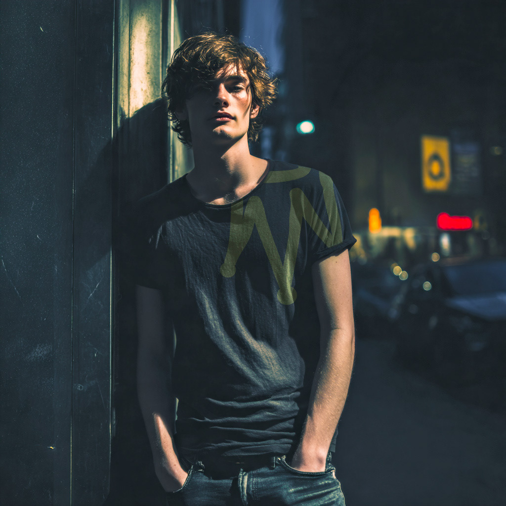
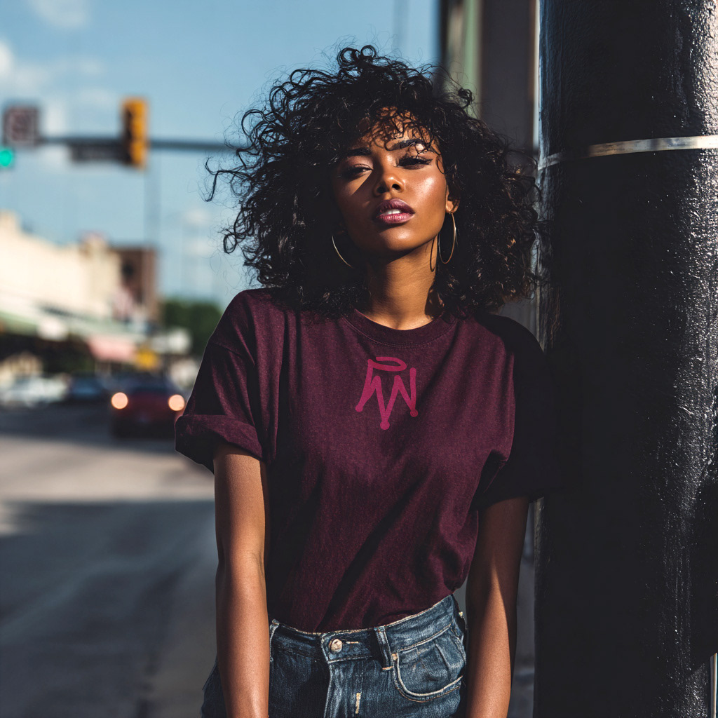
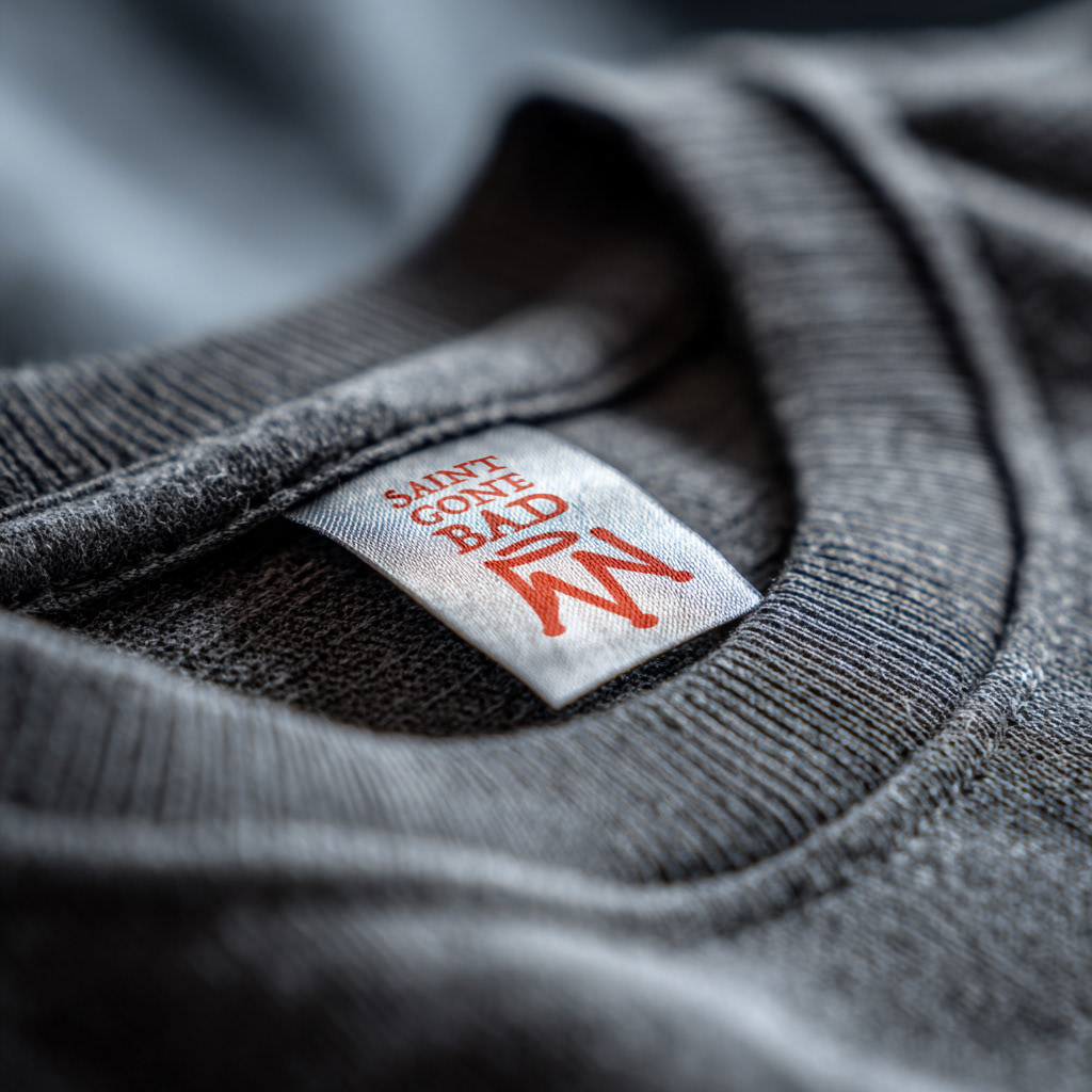
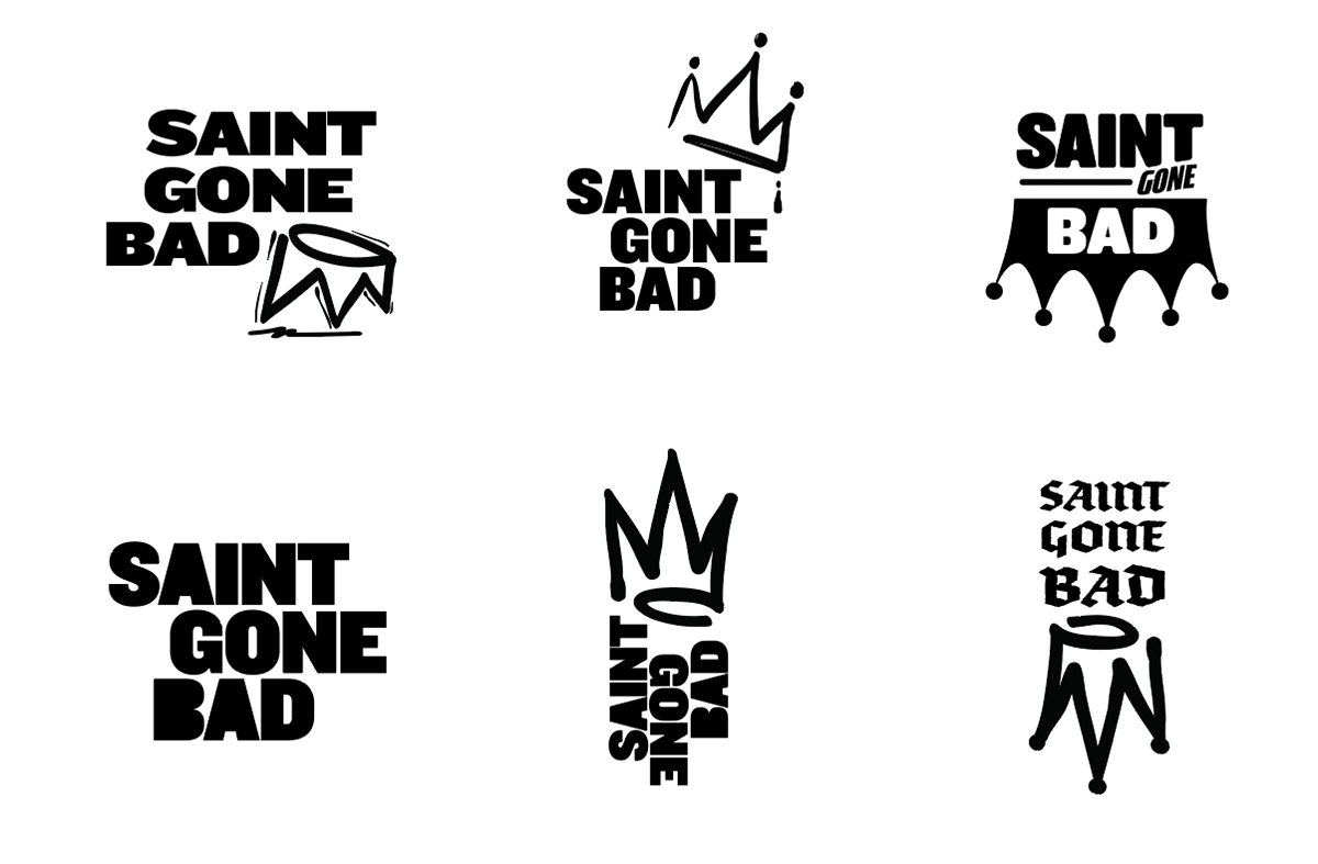
We decided a medieval crown would symbolize sainthood and a hand drawn approach would feel more rebellious and less saintly. Turning the crown over felt even more like a fall from grace with the top almost forming a roughly drawn halo. We ultimately chose a grungy serif type style for the audience and to enhance the street style appeal.
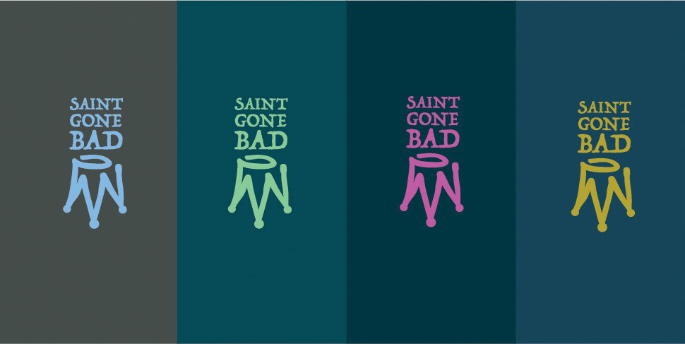
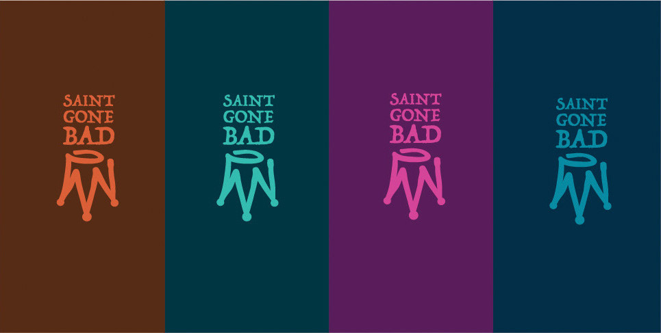
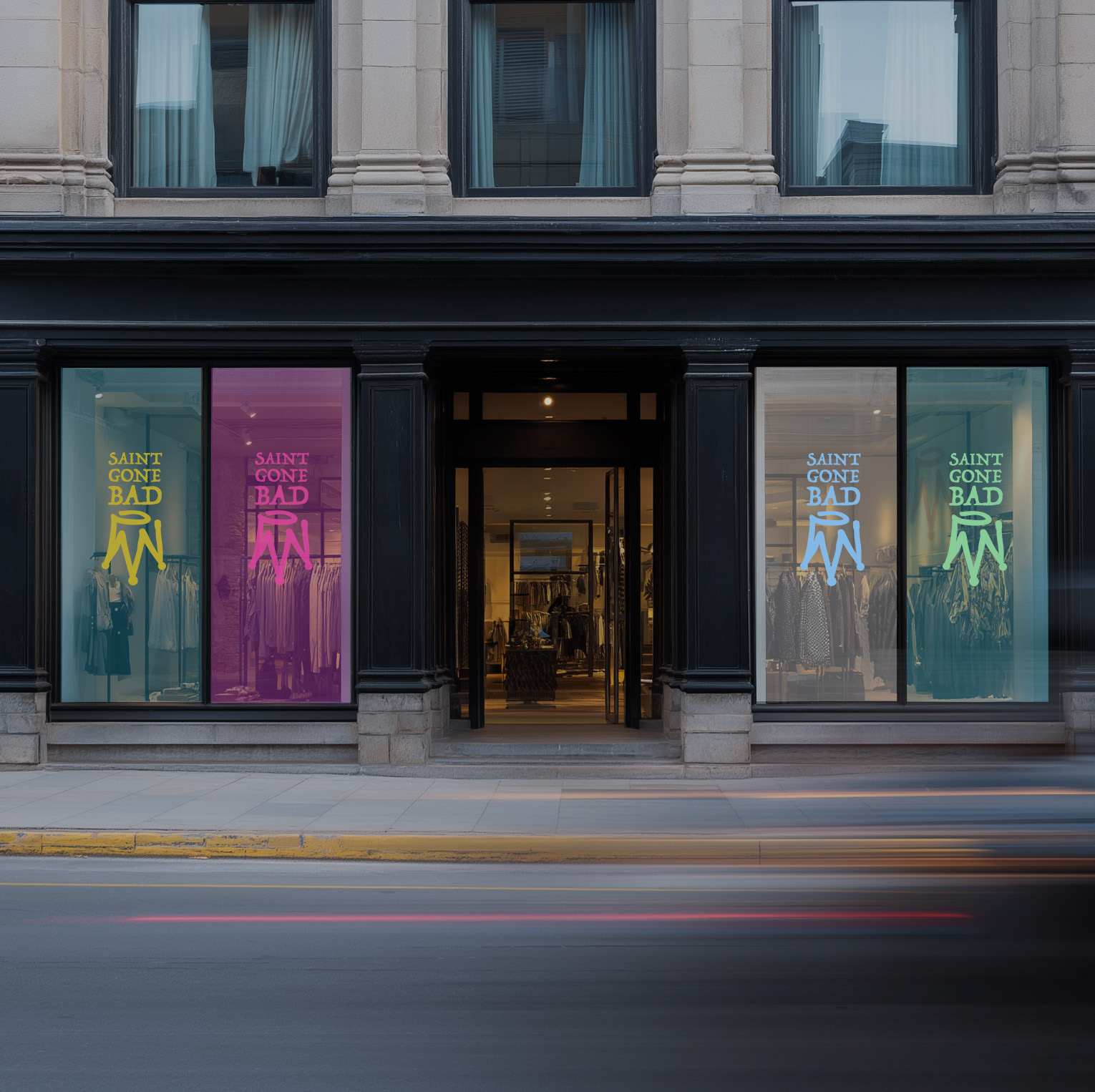
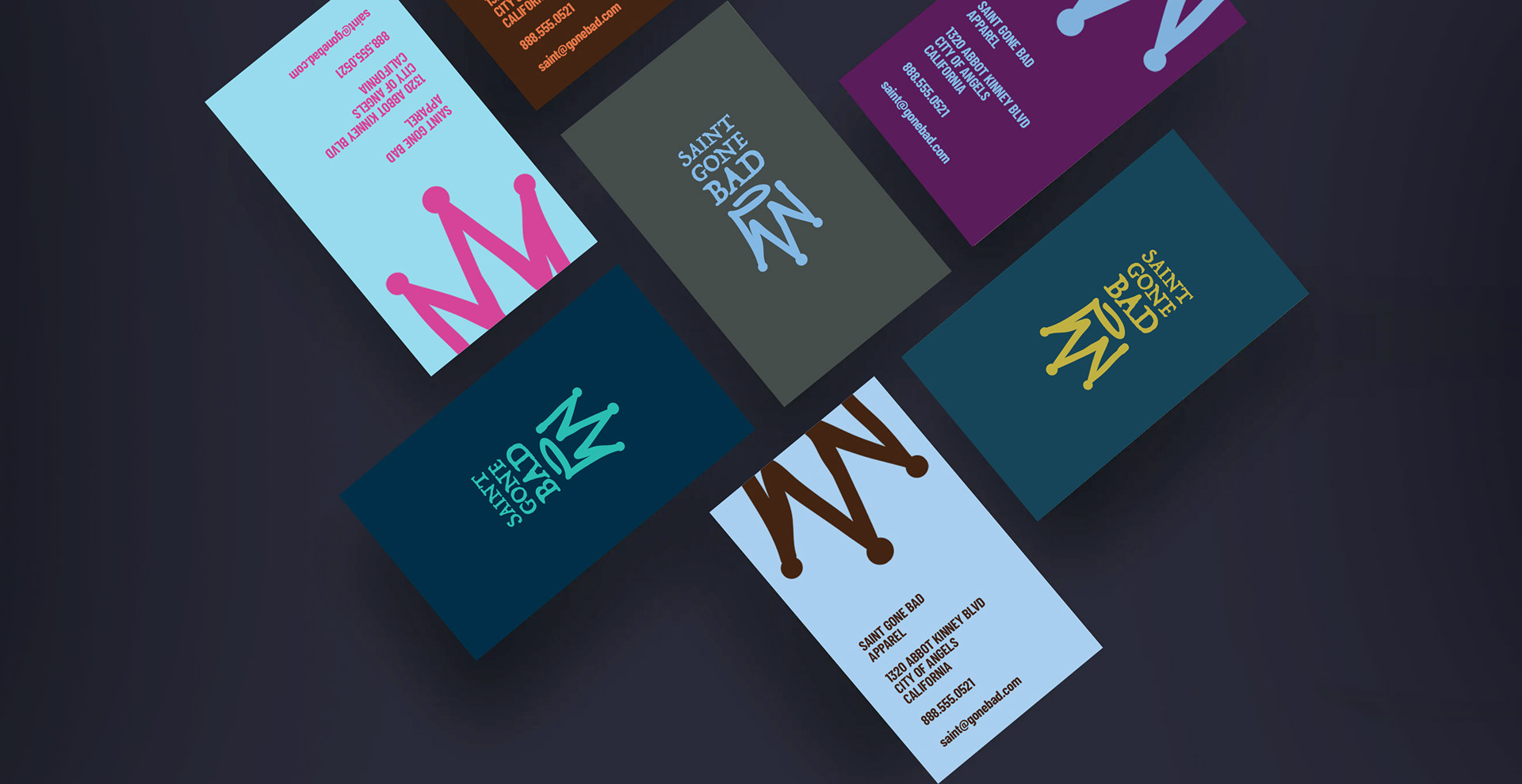
The color palette focuses on broad, rich combinations rather than specific, narrowed choices. This allows the brand to exist anywhere, in multiple environments, leaving the choices of how to combine styles and colors entirely up to the customer.